After my previous post How to visualize data? I was unsatisfied with the visualization provided by the Palo Suite provided by Jedox. This could have several reasons, not the least, that I may not have been able to get the max out of it. But the quality of the resulting diagramms and it’s interactivity were lacking for the purposes I have to deal with, especially after working with Circos the last few weeks.
So I went hunting for something easy to integrate into my Palo Suite.
Palo provides an interface for integration “widgets” into their webreporting environment. This interface provides one Javascript function that is easy to use. This made the choice of what kind of library to use easier, but there are still a lot available. Here is a list of some I came across:
There are a lot more out there and sometime I had to decide on one. So I settled on NVD3.js since I liked the look of the graphics and because it is based on Data Driven Documents.
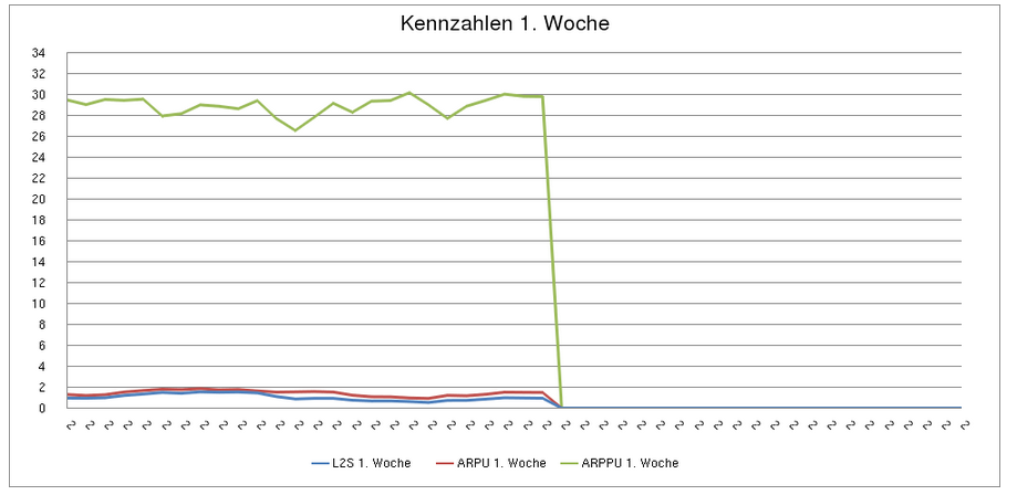
It supports several types of graphs already and integrating them all into the interface provided by Jedox, got me quick results. Here is a quick view on the difference between Palo built-in graphics and NVD3.js. Both graphs are based on the same data.
For anyone interessted I uploaded the file here. This is just a quick hack and not very representable, but it shows how it works.


Leave a Reply